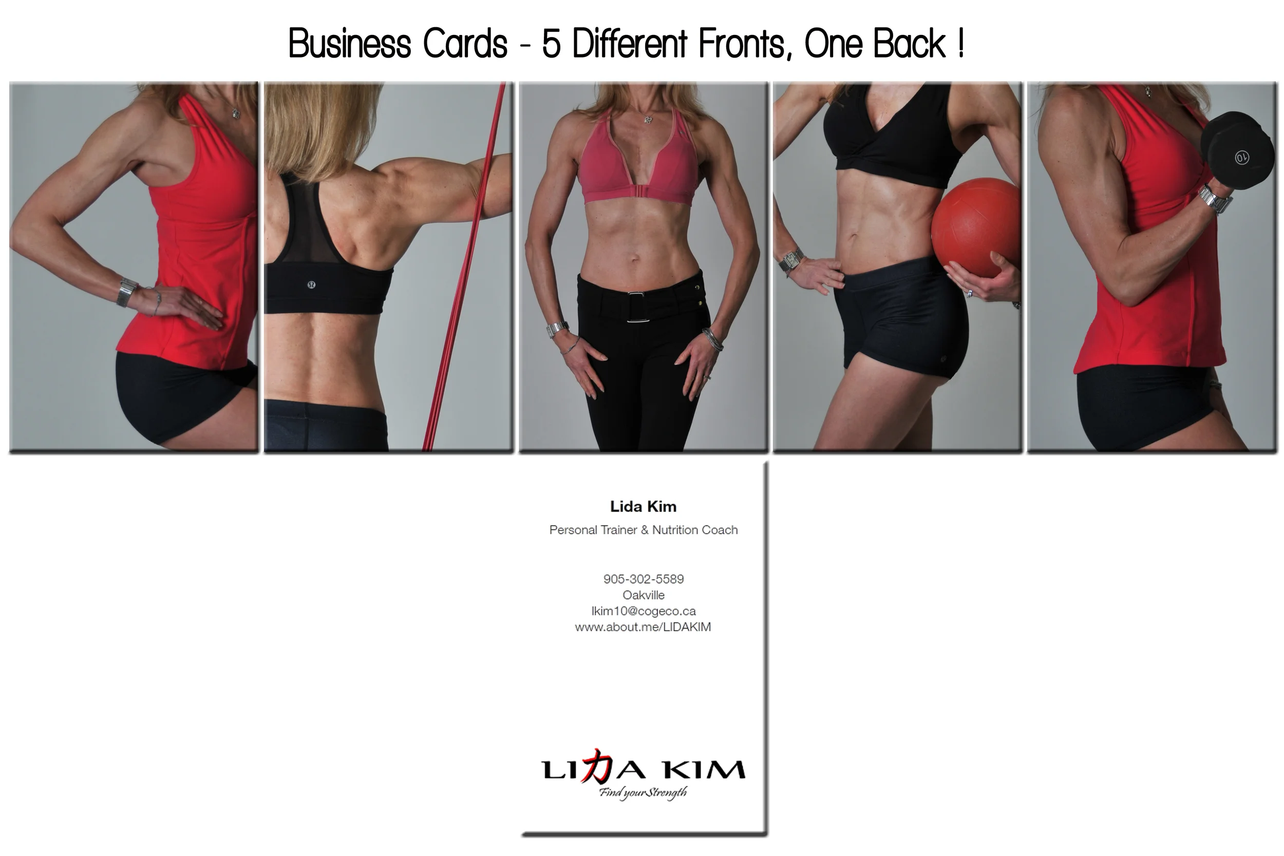


PERSONAL TRAINER - LIDA KIM
LIDA KIM is a personal trainer who was looking for some new photographs of herself for her business cards. Working together we built a whole new look and feel for her.
It all started in the discovery process, who are YOU really and why are you different from any other trainer?
Lida's focus is on strength building, and muscle. Her philosophy is that muscle eats fat even when at rest, so if when you are working out you focus on building muscle, that muscle will continue to work for you even when you're not working out. During our discovery process, Lida realized that not only does she build physical strength with her clients, but often she helps with emotional strength and self confidence - INNER STRENGTH. Helping people spend a little time on themselves and as a result feel better about themselves!
We wanted to Brand her around her name. She is a small business and really wanted to ensure that it was her name people would see and remember. With "Strength" being the focus I started to research and work on a look for Lida. Then I stumbled on the symbol that is used as the 'D' in Lida's name. This is the Korean symbol for strength. this was powerful on 2 fronts. First, and simply it represented Strength and it looked very much like the letter 'D' and could easily be built into her name branding. Secondly, and more importantly, Lida's husband and children are Korean, so this symbol had personal meaning to her and her family.
"Find Your Strength" became the obvious tag line.
These types of personal linkages to your brand are so important when you decide on how you want to display yourself to the world. It needs to truly be YOU, it needs to speak for you when you're not there.
Take a look at the images we created for her!